1.0 General Creative Guidelines
We apply a high creative bar to ad content to ensure a consistent, high-quality customer experience. The policies in this section apply to all ads and serve to ensure a minimum quality bar. These policies apply to all Display Ads in all locales unless otherwise indicated. All product or locale variations are listed in the relevant sections.
1.1 Advertiser Branding
Your brand name or logo must be clearly visible in the ad to ensure that customers can readily identify you as the advertiser.
- The advertiser’s brand name or logo must be clearly legible in the ad to ensure customers can easily identify the advertiser.
- If an ad features both your brand name or logo and an Amazon logo, your brand name or logo must be the largest and most prominent.
- For ads promoting movies, TV shows, video games, music titles, and apps, the name of a band, or the title of a TV show, movie, or video game can be treated as the brand name.
- The text within a brand logo is not subject to the minimum font size requirements provided the advertiser is recognizable.
- Mobile ads: On 320x50, 414x125, and 728x90 mobile ads, where ad units are limited in space, if the logo text is not legible (at least minimum font size for disclosure), the logo must at least take up 100% of the ad height or at least 20% of the ad width.
1.2 Background Colors and Borders
Customers must be able to distinguish ads from non-sponsored content on the page. Amazon imposes certain restrictions on background colors and design to ensure that ads are distinct from non-sponsored content on the page, and that customers can identify the clickable spaces associated with an ad.
- Ads without borders cannot feature white or off-white background color.
- If an ad does not have a border, it must feature a background color that contrasts with the white/off-white background color of the page. For example, ads without borders can feature a light gray background color.
- Mobile ads cannot have a white bar dividing the creative, as this mimics elements of Amazon Mobile Homepage house creatives.
- Ads that take up most of the screen (such as mobile interstitial ads, tablet and Kindle wake screen ads) or are distinct from their page backgrounds because of ad placement design (such as Marquee ads, Seller Central log-in and homepage placements) do not require a border. See individual specs pages for more details about background broand border requirements per ad product.
- Americas and EU only: The vivid, highly saturated colors shown below are prohibited as full-bleed ad background colors in 970x250 Billboard BTF and 600x500 Mobile Homepage BTF. This applies to the colors shown below when used as 100% edge to edge single background colors, without gradients or patterns. In these placements, vivid colors can only be used as an accent or highlight colors. Just the shades shown below are restricted. and dark background colors are permitted.
Prohibited vivid, highly saturated colors on 970x250 Billboard BTF, 600x500 Mobile Home Page BTF + Tablet Shopping Apps HP, and 1940x500 Tablet Shopping Apps Detail Page:

Vivid, higly saturated colors are not permitted as full-bleed ad background colors in our most prominent placements.
1.3 Borders
Our requirements on the use of borders ensure that the customer can identify the clickable spaces associated with an ad.
The following ad units do not require a border:
- Marquee ads
- Mobile interstitial ads
- Mobile/Tablet Encore Ads
- Fire Tablet Wake Screen
- Kindle screensaver
- If the ad has a white or off-white background, it must feature a visible border. The border must be 1-pixel, except for the following mobile placements: 2-pixel border (in 2x)
- Homepage 600x500
- Homepage Tablet Shopping Apps 600x500
- 3-pixel border (in 3x)
- Detail page 1242x375
- Search results page 1242x375
1.4 Distracting Ads
Animation features and other interactive elements in ads must be engaging and complement the customer experience, and must not distract or deceive.
Prohibited distracting features include, but are not limited to:
- Flashing, blinking, or, pulsating objects, images, or text. Ad elements that pulsate for up to three seconds (such as a CTA button that animates briefly at the end of an ad) are permitted provided they do not mimic user interaction.
- Frequent or fast contrast transitions (for example frames with multiple changes from white to black).
- Excessive animation (for example, frame changes occur every 1 or 2 seconds or visual objects within the animation that seem to move constantly).
- Animation that mimics user interaction, such as moving mouse cursors or clicking buttons.
- Objects, images or text that animate in response to the ad being moused-over (this is permitted only in ads running off Amazon).
1.5 Fake functionality
Fake functionality can trick customers into clicking on ads by believing that certain inactive elements of an ad are interactive and can provide value to them.
Ad elements that a customer would usually expect to be able to interact with must be functional. For example, ads with a free text field prompting the customer to “enter your zip code” must lead to a landing page with information tailored to the entered postcode. Driving to a generic landing page or asking for the zip code to be re-entered is prohibited.
1.6 Image Quality
To be consistent with the rest of the content on the page and ensure that customers can read and understand the ad, we prohibit low-quality images (as described below).
Images in ads must meet the file size, resolution, and file type restrictions that are specified per size/placement (see ad specs for more details).
Prohibited low-quality images include, but are not limited to: crowded images with too many visual objects in one creative, blurry, distorted, low-resolution, pixelated, smudged, or stretched images.
1.7 Pop-Ups and Pop-Unders
Intrusive pop-ups and pop-unders present several quality issues, including surprising the customer with content that unexpectedly takes over the screen and slows down the page load. We restrict the use of pop-ups & prohibit the use of pop-unders to protect customers from intrusive and frustrating experiences.
The following are prohibited:
- All pop-unders.
- Pop-ups tabs, windows, or modals unless they are relevant to the service advertised AND beneficial to the customer experience. For example, location prompts on the landing page used to tailor the service to the customer’s location are permitted.
- “Exit strategies” such as asking the customers to confirm multiple times if they are sure about closing the page.
1.8 Sponsored Display custom images
Custom images allow you to include compelling images that represent your products or brand in context or a lifestyle setting in your ad. Images must not contradict the landing page and must be of high resolution and quality and aesthetically pleasing. Images must not:
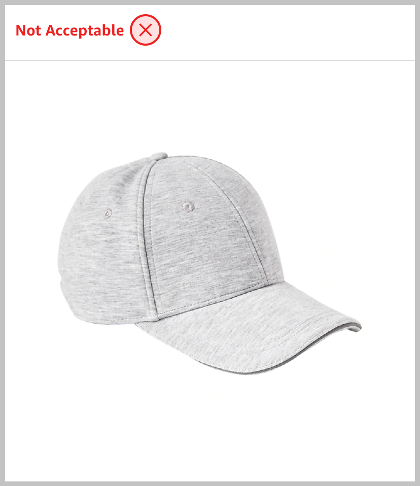
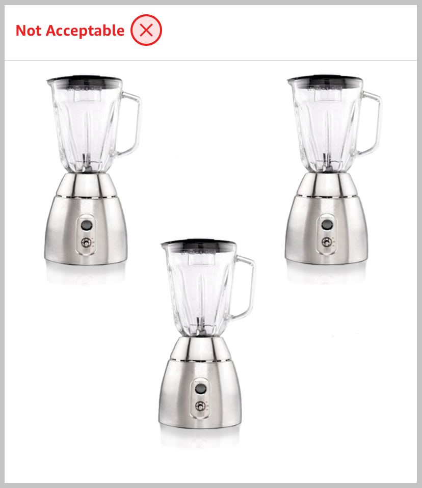
- Be individual or multiple product images on a solid or transparent background.
- Be an individual brand logo or combination of logos.
- Be one of your selected product images.
- Contain crowded, excessive, poorly cropped or illegible elements.
- Contain additional text other than text naturally present in the image (such as on product packaging).
- Contain letterbox or pillarbox formats.
See below for image examples and How to build brand creatives to engage Amazon shoppers for more information.
Individual and multiple product images:

Product displayed in lifestyle setting

Individual product image

Product displayed in context

Multiple product images
Individual and multiple logos:

Individual brand logo

Multiple brand logos
Crowded images and text images:

Crowded and poorly cropped image

Text in image
Letterbox or pillarbox formats:

Letter box image

Pillar box image
Amazon Ads Guidelines and Acceptance Policies
TABLE OF CONTENTS